The Art of Mixing Modern & Classic Design Elements in Luxury Design

Picture this: A classic design moment that brings clear design roots, cast against a crisply modern design thought. What an interior design feast that is – a dramatic delight.
There is fantastic, layered nuance and excitement when IDH mixes classics with a more contemporary edge in luxury design. The eye-catching allure is undeniable. Ultimately, the design tension between the two opposing elements — traditional and modern — creates unmissable excitement. Take a walk with us into an IDH space and enjoy some insights.
Since mixing the right old-world style with a modern aesthetic in luxury design is nothing short of an art form — when it’s right for one of our clients – it’s an art we happily indulge at IDH because it does afford such an incredible impact.

The ratio for success
The artistry of this mix comes down to math — ratio balances. For this demanding combination of classic and modern elements to be successful, this is not the time to go fifty-fifty!
If the design style mixture falls into an even 50/50 trap, things can quickly look hodge-podge. Instead, keep that ratio of modern to traditional closer to 70/30 or 80/20 for success.
A foyer with an impeccable mix
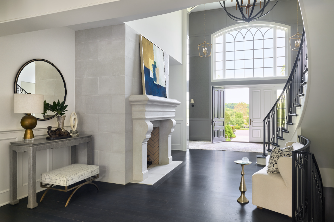
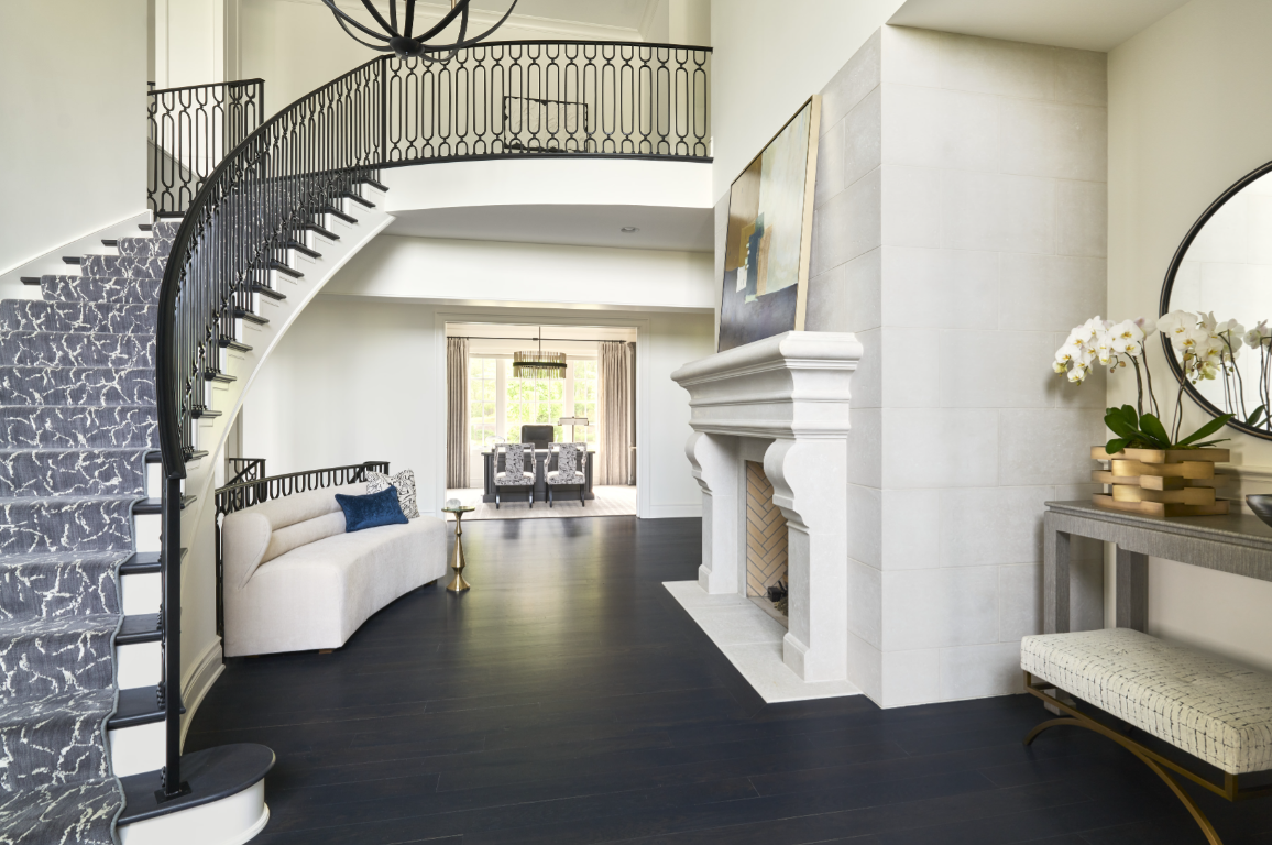
For a recent grand foyer we designed for a client, we took the 80-20 approach. The 20% classic design came in with a large-scale, carved-stone fireplace that’s reminiscent of the residences of old-world Europe.

To make this massive focal point look intriguing and relevant — and not dated — we cast modern elements against it. Exhibit A: The attention-getting abstract painting that’s perched right on top of the fireplace mantel – it’s a wow moment. Anything but modern art would be a miss.
We also took a more modern approach with the staircase railing. The metalwork is far more contemporary than a wood banister. Likewise, the stair runner is modern-leaning, with its abstract pattern and palette. It provides dynamism and movement.
Brokering the balance with transitional elements
When mixing the modern and classics, it can also be helpful to add in a few transitional pieces that marry the mix in beautiful harmony. For this great hall area, we added a custom curved settee — which takes cues from traditional design, but that are executed in modern style.
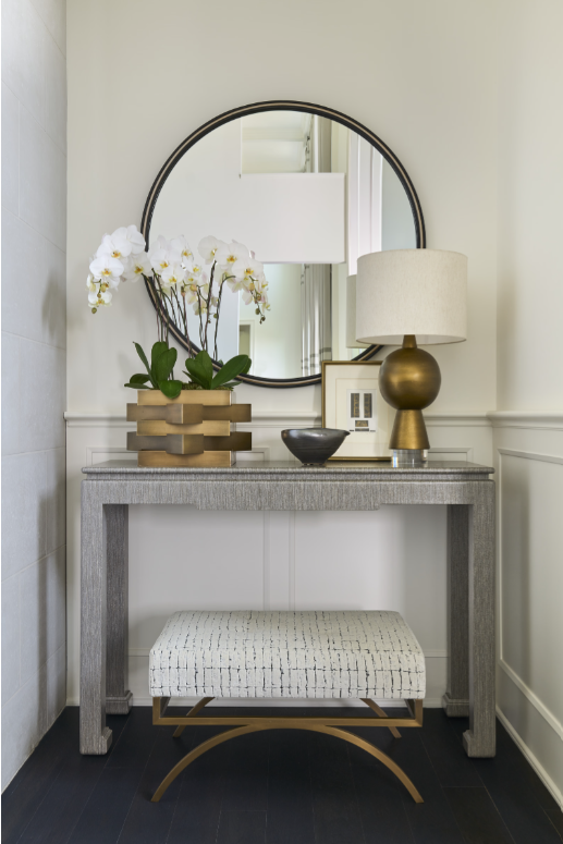
In addition, the shape of the twin shagreen-wrapped console tables has a classic chinoiserie feel but the shagreen wrapping, and artful, streamlined accessories add a needed modernity.

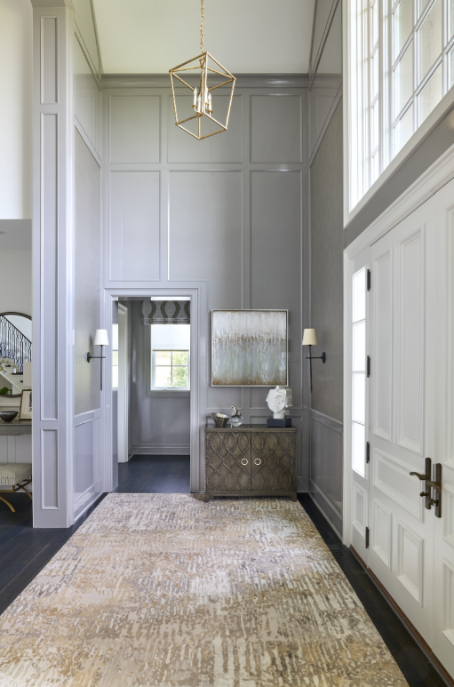
Prior to our joining the project, a light fixture “placeholder” had been specified which was quite traditional. Instead, we suggested the more transitional-styled, two-color globe because it brought controlled curvaceous lines — and – a necessary more modern/transitional lean.
What a perfectly balanced gem of a space that daily delights our clients as much as it does their guests.
–
At IDH, we’re passionate about designing the most impeccable mix of elements in every room that speak specifically to what you, our clients, love most. That might look like all modern for you, all transitional for you, or a mix between the classic and the modern sensibility. No matter what – it will be personal….to YOU. Contact us to learn more.