Maximizing Space with Minimalism: The Contemporary Luxury Aesthetic

There are many design tricks we have up our sleeves when it comes to making a small space look and feel larger — whether it’s a guest bedroom, kitchen, office, library, powder room, or somewhere else entirely.
One of the ways we can maximize a space is through the power of minimalism — which is ultimately in service of that contemporary luxury interior design aesthetic we’re all craving.
We recently put the power of minimalism to the test in a tiny but mighty foyer that we created for a client as part of their whole interior home design. Because, make no mistake, the foyer is just as important as any other area in a home.
So, in this entryway interior design, where we wanted to make a big statement without overdoing the design, we had to be very intentional with three things: shape, scale, and color.

The Shape Up
Playing with shapes is the fun — and the challenge — of maximizing a space through minimalism to signal a contemporary luxury interior design aesthetic. And “shape” becomes especially relevant in a space with smaller square footage, like a foyer.
Foyers not only provide an opportunity to welcome guests into your home, but they can serve up some major wow factor when maximized correctly.
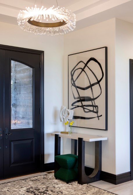
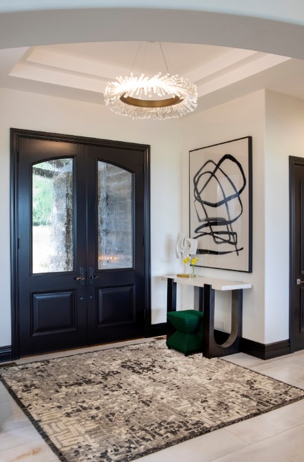
Case in point? In this entry, the architect gave us a dual-stepped ceiling tray, which screamed for an interesting piece of jewelry as a light fixture that we knew our client would love. A modern, circular stunner illuminates the area and juxtaposes the square ceiling, providing an incredible focal point and elevating the contemporary-luxury mood.
To make the space feel larger, we also took “shape” to the floor. Instead of a small, standard runner, we took the liberty of placing an area rug in a strong, square shape — which also automatically resonated with the wonderful tray shape in the ceiling.
The repetition of shape from ceiling to floor and back again — what an understated yet profound impact.

The Scale Up
Scale is important — no matter what — but especially when the goal is to maximize a space through minimalism. Because please remember: Minimalism doesn’t necessarily mean “small.” It’s about the careful curation of elements to make a space sing.
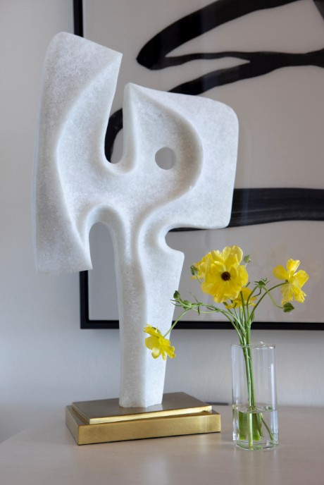
For this entryway interior design, if we had hung a small piece of artwork on the wall — instead of this abstract beauty — the space would have looked like it needed a blood transfusion. Large gestures in small spaces can pay big dividends. The smaller table sculpture is the perfect partner in scale and likewise repeats the painted abstract shapes above in dimensional fashion.
Furnishings are another moment where scale is essential — and where thinking outside the box leads to gorgeous results.
In this space, we deconstructed a large console table to make it half its original size — and properly scaled to the entry. Custom pieces are a game-changer to ensure you have just the right piece in the right scale to elevate a contemporary luxury interior design aesthetic.
The Color Up
Color is such a strong tool to maximize a space through the flick of a paintbrush; it’s all about thoughtfully unifying disparate elements. That console table? We also recolored it to black, so it spoke with the artwork above. Now, they are ideal pairings to one another.
We also brought that soft black hue to the door and millwork, elevating the space so dramatically yet in a minimalist way.
The final touches happened in small yet statement-making pops of accent colors. A green boucle ottoman provides visual interest while serving a functional purpose. A sprinkling of yellow blooms is a sunny delight.
—
A foyer is only one of many spaces in interior home design that can be maximized through minimalism. And just like every single space we impeccably design, there’s no one-size-fits-all formula.
For more examples of how our interior design firm personalizes a contemporary-luxury aesthetic in every space we create, check out our portfolio of projects.
 Luxe Magazine Residential Excellence in Design