MAISON & OBJET TREND REPORT PT2 – COLORS
As promised, we are releasing our trend reporting from Maison & Objet in several easily nibbled upon blogs by breaking down the design trends that we observed, into a series of “bite sized” topics.
This bite will satisfy the craving for the latest in color trends!
From a bird’s eye view, we saw that post-pandemic design lovers are looking to create an ambience that exudes joy and warmth within their immediate surroundings.
Trends show that contrast is still key, but stark white, on white, on cream, and even more white…with the occasional black accent was noticeably less dominating at the show. We do not believe black, and cream are off trend, but there was a visible new push to incorporate color this year.
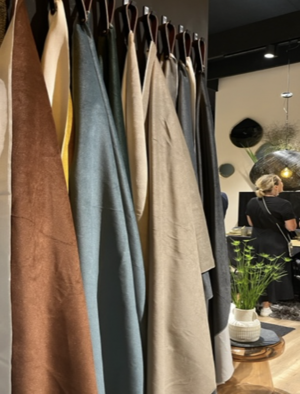
Uber dark flooring and deep colored leathers have softened into more mid-tone color contrasts – dark walnuts subtly replaced with lighter pines and oak, paired with chunky bouclés and buttery linens.
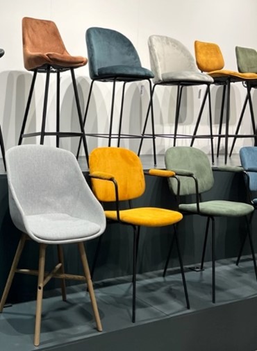
Warm woods were, punctuated with fabric stories in fetching cozy ambers, serene sage, blushing mauves, and rich emeralds. For years, gray dominated internationally, and although mostly absent at this show this year, some whispery soft, light and mid-tone grays peeked through now and again. No surprise there, as gray has forever been one of the important neutrals.
Without question, the joy of color is back, albeit in more of an accent role as opposed to the main event.
If we had to give you a visual of the palette du jour, we would suggest conjuring in your mind an autumnal seascape.
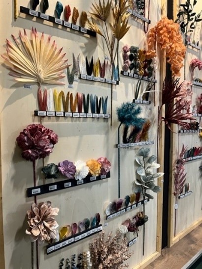
The spectrum of soothing blues and greens of the sea abound.
Toasty tones of drying seagrasses dance and sway in swirls of rusts, goldenrod, and muted moss greens.
Textured leaves skip and twirl merrily along the creamy dance floor of the sand, intermittently interrupted with a small kiss of mauve in the occasional seashell.
Light, airy and playful is this season’s name of the game. Also noted as a maturing design development, is the continued leaning towards warmer neutrals.
Once we identified the key color players, we saw these same rhythmic palette patterns repeating in vignette after vignette throughout Maison and Objet, composing the welcoming symphony of these most recent color trends.
Now, regardless of that beautiful trend symphony, allow us to offer a word of color-trend caution to those of you who may be near panic about the colors in your home:
First, there is never ONE SINGLE trend on the development scale at a time. Multiple trends are always developing at any given time.
Next, trends do not necessarily have a definitive “start or stop”, but rather morph into existence. Look around your home and see if you can recognize any of your own trends that have now developed slightly into the most recent looks that are trending. It is a gradual process, so no need to stress!
And lastly, as design thought leaders, we can assure you that it’s the WAY color is used in interior design that becomes trendy, far more than the color itself.
For example: Think back to the trending Restoration Hardware aesthetic of several years ago, when every blessed surface in the room was gray: gray walls, gray upholstery, gray driftwood furniture plopped onto a gray rug. THAT was a trendy interior on steroids. 😊
When we guide clients to lean into classic design, it is because it is exactly that: timeless, and therefore has staying power. However, when leaning into the classic design, we do so with an eye on trends that will complement our clients’ inner cravings for impeccable, tasteful classicism. We keep up on trends but are never a slave to them.
Make sure to check out Part 3 of our Maison & Object design trend report! In our next blog in the series, we reveal the materials that showed up strong at this year’s show.
And if you missed Part I about Maison & Objet design trends, you can find that blog here.