Luxury Interior Design for Small Spaces
We all probably have at least one room in our homes that we wish was a little bit (or a LOT) bigger. Maybe it’s a guest bedroom, a foyer, a kitchen, an office, or even a library.
If you are raising your hand here, I have good news for you. We’re tackling small space interior room design and I want you to know that there are still a lot of possibilities for your petite-feeling space.
There are many ways we can maximize the feeling of space with wise design strategies that will quickly make you forget that square footage was ever an issue.
Here are my top six hacks for small space luxury interior design.

1. Put custom furnishings to work
If there ever was a time to go custom, it’s now. Luxury interior design requires it — especially in a small space — because you can truly bend a space around the furnishings.
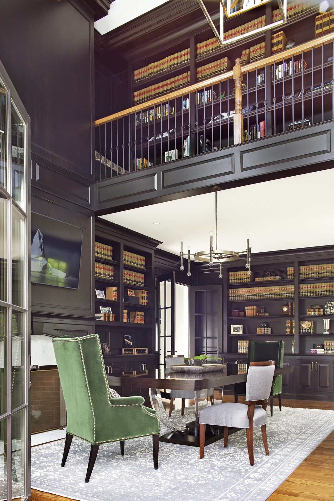
For a library-meets-home office interior design, we had very a small footprint to achieve multiple goals for the room. Yet we created a stunning result that boasts a commanding CEO personality without eating too much space.
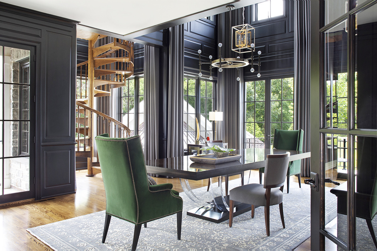
Custom furniture is owed a huge credit as a VIP player here. Pull up your custom green velvet armchair and take your meetings from here because we designed space-enhancing pieces that really make the grade. Those armchairs have open shoulders that are sculptural and absolutely intriguing. As for the custom-built desk, it was designed in unison and built from the same thought as the surrounding cabinetry, introducing aesthetic unity to likewise expand the space.
The custom rug was a complex assignment to specifically piece and sew around the custom desk, but what a gem. The lighter color opens the space, while the subtle pattern expands it out even more.
2. Add glass
Glass is always going to be your go-to sidekick in a small space. For example, in a kitchen, add some glass cabinets if at all possible. Doing so will massively increase the sense of “space” and “window.” (But you must be sure they are beautifully styled.)
Gorgeous lighting that features the transparency of glass is nothing short of eye candy and another way to achieve a sense of openness yet good-looking impact.
For this library, we added glass doors at the entrance to set the space functionally apart yet keep that open feeling we wanted. The translucent base of the custom desk also introduces a lightness that doesn’t weigh the room down. We also added a glass sculpture that is space-expanding and bespoke.

3. Enlarge the windows
Speaking of glass, windows are your best friend in a small space — but don’t miss your chance to elevate this asset!
Inside-mounted window treatments, or treatments mounted on the casement frame, immediately make windows appear smaller and, consequently, a space feel more closed-in.
Instead, opt for something mounted as high above the window as possible. This allows you to stay off the glass even more while also creating the illusion of a taller window. It’s a win-win!
In this library, we went doubly plush with a very generous proportion on the two-story window treatments. They virtually sank into the wall and appeared to push the windows outward for an incredible space-expanding effect.
4. Use color with intention
Color is such a powerful design tool; it exerts a constant influence and impacts our perception of a space, and it can certainly change how big (or small) a room feels.
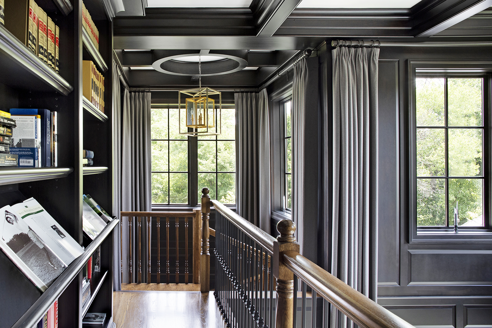
When you’re trying to visually expand a room, a very controlled color palette is absolutely going to work to your advantage, which means you don’t want a lot of changing colors in the same small space. For this library, we leaned into the unity of a handsome, gunmetal-gray hue throughout.
It’s a color that was beloved by our client — and that is always our priority. Rather than subscribe to trends, we nod to what makes our homeowners come alive in a space.

5. Add reflectivity and shine
From subtle glows to high-polish lighting, accessories, and hardware, this is the time to bring in the sparkle factor. Shine reflects and enhances light which, in turn, helps spaces feel fresher and more open. Mirrors can also be used strategically in this same way.
6. Curate and edit with no mercy
Visual clutter automatically makes a space feel smaller — no matter how large or tiny it actually is. The idea here is to carefully curate every single thing with the utmost intention and remove extraneous items from desks and countertops. This allows for more clear expanses, which makes spaces feel lighter, brighter, and bigger.
Even in a library that’s full of books, we were able to impeccably place every single page and accessory.
—
To all things design, there is a solution — even a small space that you wish was so much bigger. If you have a challenging interior room design dilemma, then give our full-service interior design firm a call. We’ll fool the eye and create a feeling of much more space.